plt_cat() is a single entry point for 11
categorical chart types with 27+ parameters. It handles
grouping, splitting, dodge/stack, labels, background bands, NA handling,
and more.
Sample Data
library(UtilsR)
library(ggplot2)

set.seed(1)
df <- data.frame(
  Type  = factor(sample(c("A","B","C"), 200, TRUE, c(0.5, 0.3, 0.2))),
  Group = factor(sample(c("X","Y","Z"), 200, TRUE)),
  Batch = factor(sample(c("B1","B2"), 200, TRUE))
)
df$Region <- factor(ifelse(df$Group %in% c("X","Y"), "R1", "R2"))
head(df)
#>   Type Group Batch Region
#> 1    A     Y    B2     R1
#> 2    A     X    B2     R1
#> 3    B     Y    B1     R1
#> 4    C     Y    B1     R1
#> 5    A     Y    B1     R1
#> 6    C     Z    B1     R2
1. Bar Chart
The most common type. Supports stat = "percent"
(default) or "count", and position = "stack"
(default) or "dodge".
plt_cat(df, "Type", "Group", type = "bar")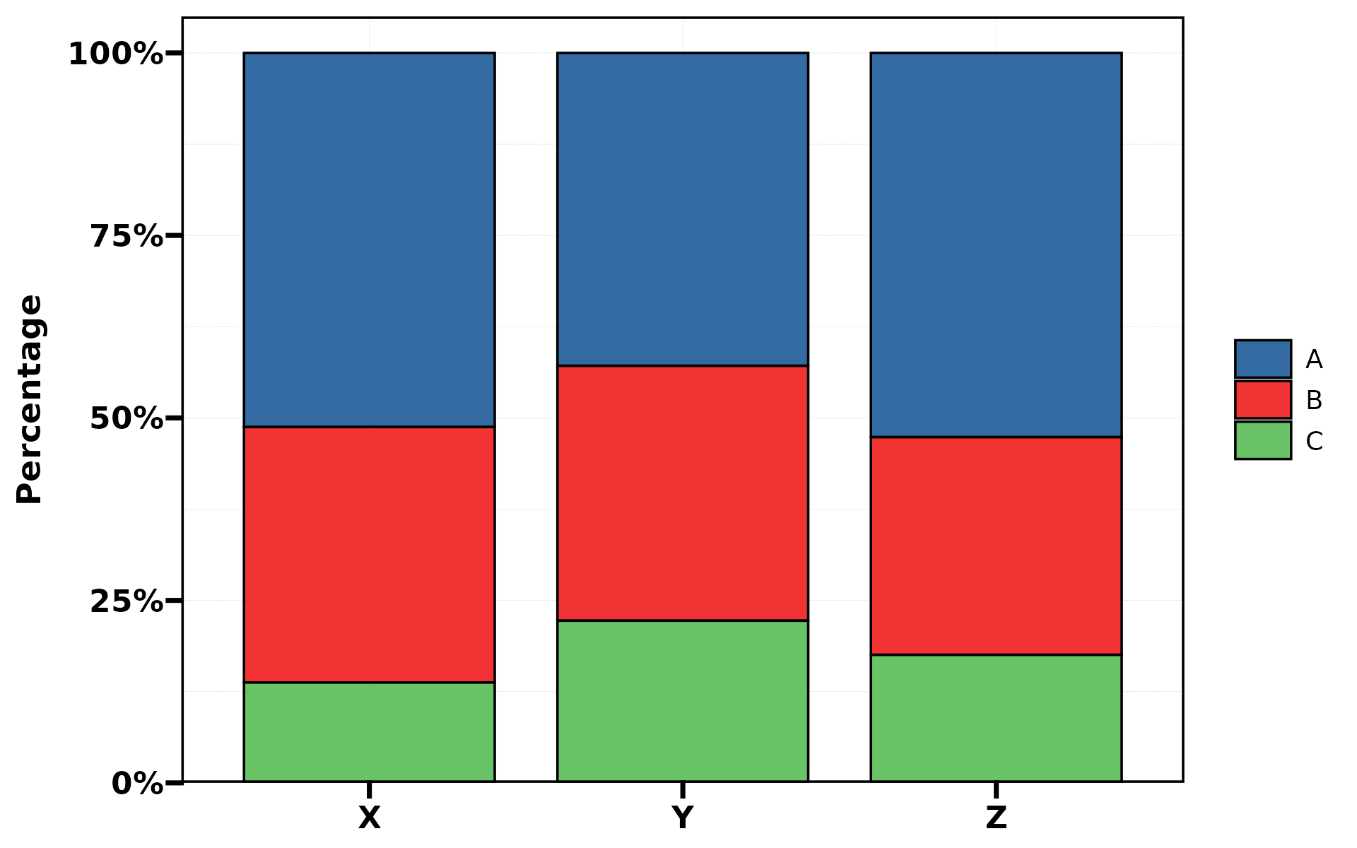
plt_cat(df, "Type", "Group", type = "bar",
        stat = "count", position = "dodge", label = TRUE)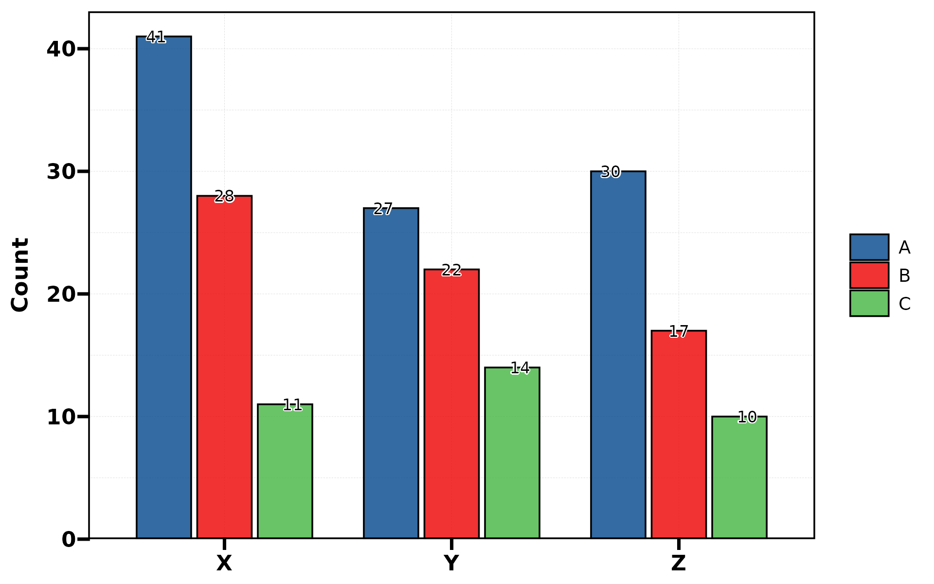
plt_cat(df, "Type", "Group", type = "bar",
        flip = TRUE, label = TRUE)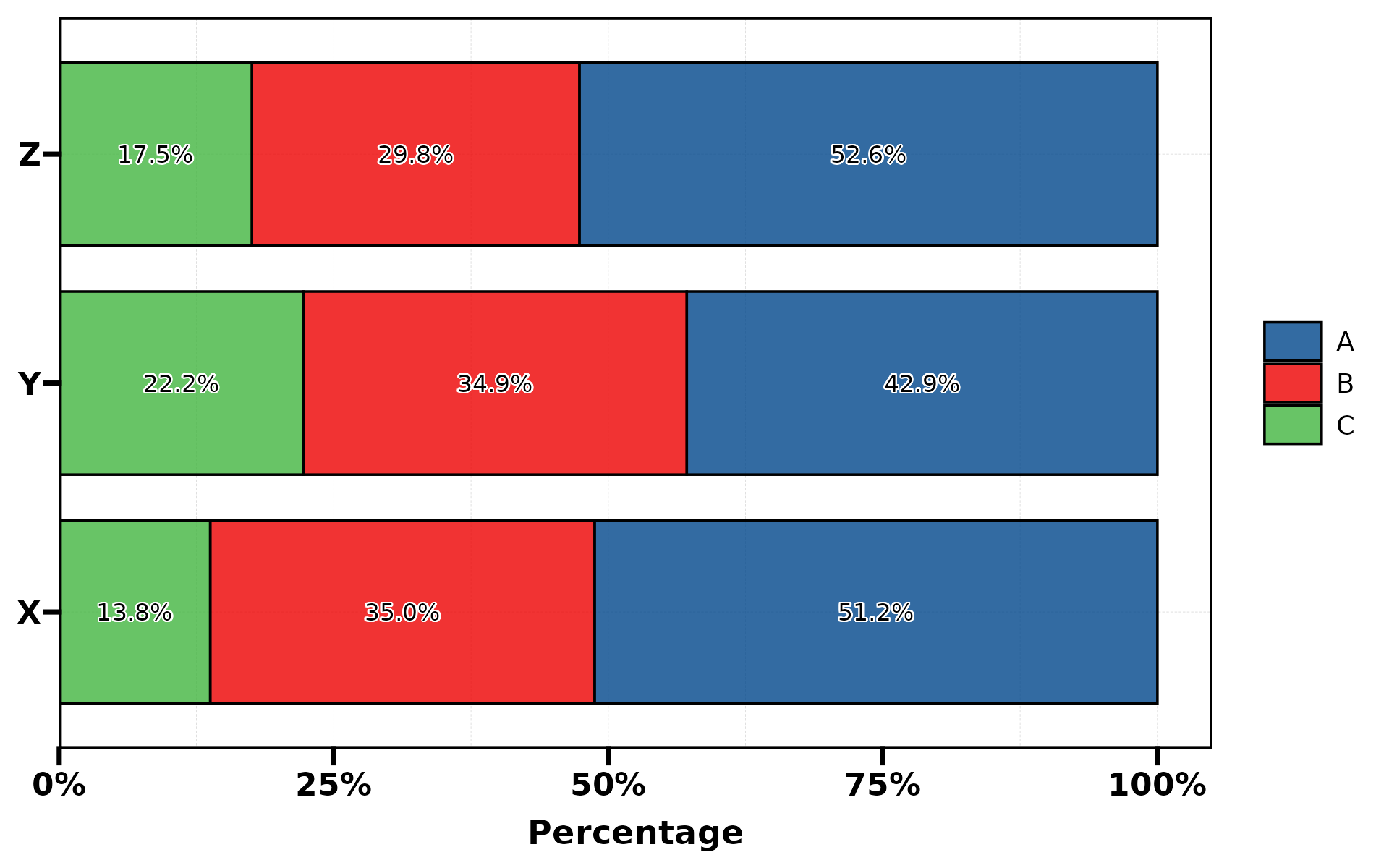
No group (single variable)
When group.by is omitted, each stat.by level becomes its
own bar:
plt_cat(df, "Type", type = "bar", stat = "count",
        label = TRUE, legend.position = "none")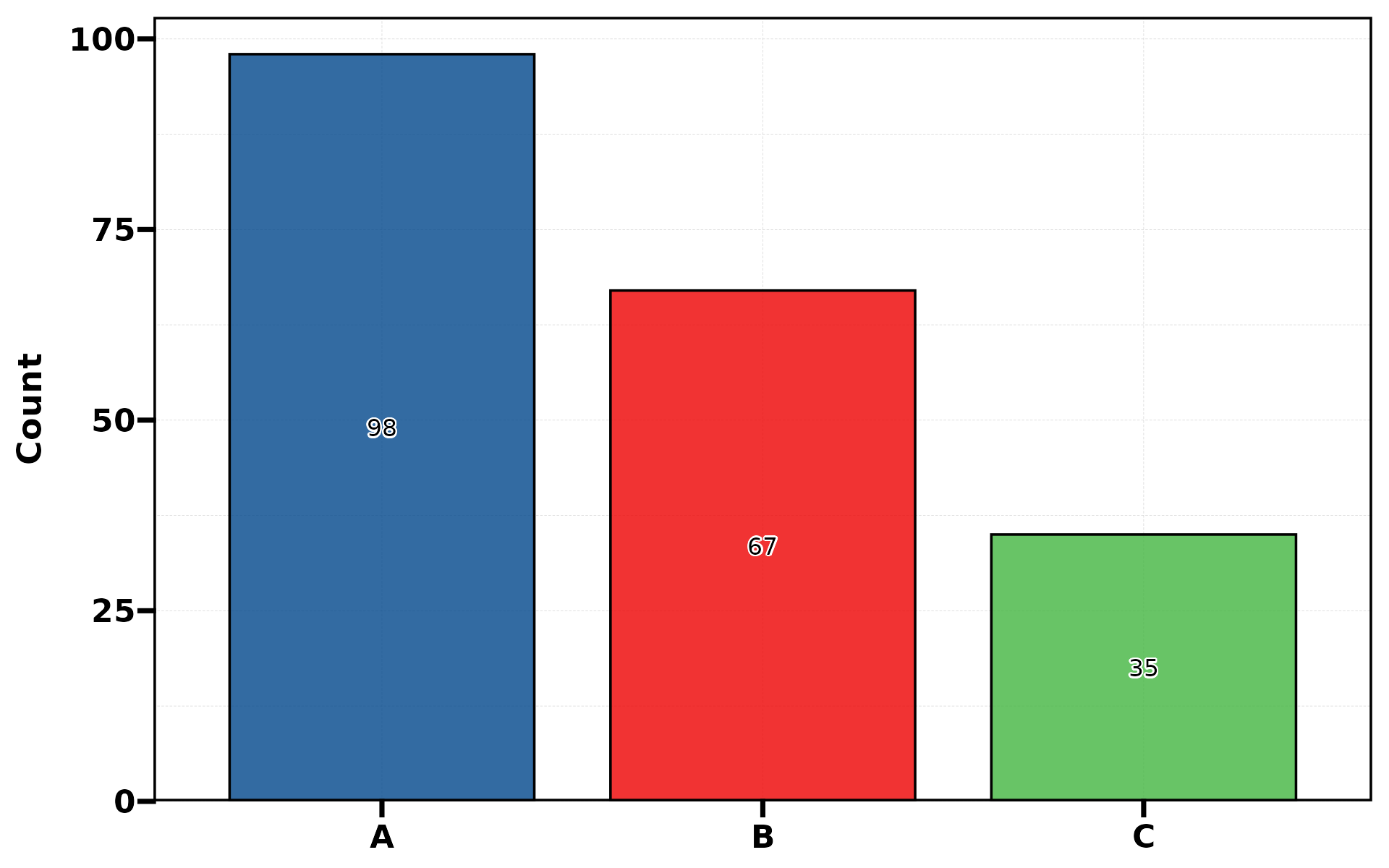
Background bands
Use bg.by in dodge mode to add alternating background
colour bands. bg.by must be a superset of
group.by (each group belongs to exactly one bg level).
plt_cat(df, "Type", "Group", type = "bar",
        position = "dodge", bg.by = "Region")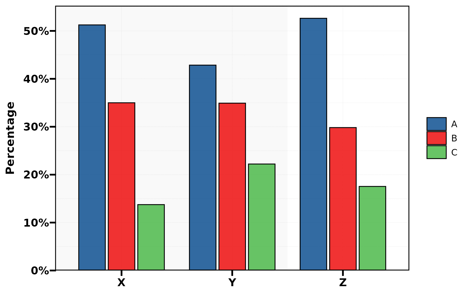
plt_cat(df, "Type", "Group", type = "bar",
        position = "dodge", bg.by = "Region",
        bg_palette = c("lightblue", "lightyellow"),
        title = "Custom Background Colors")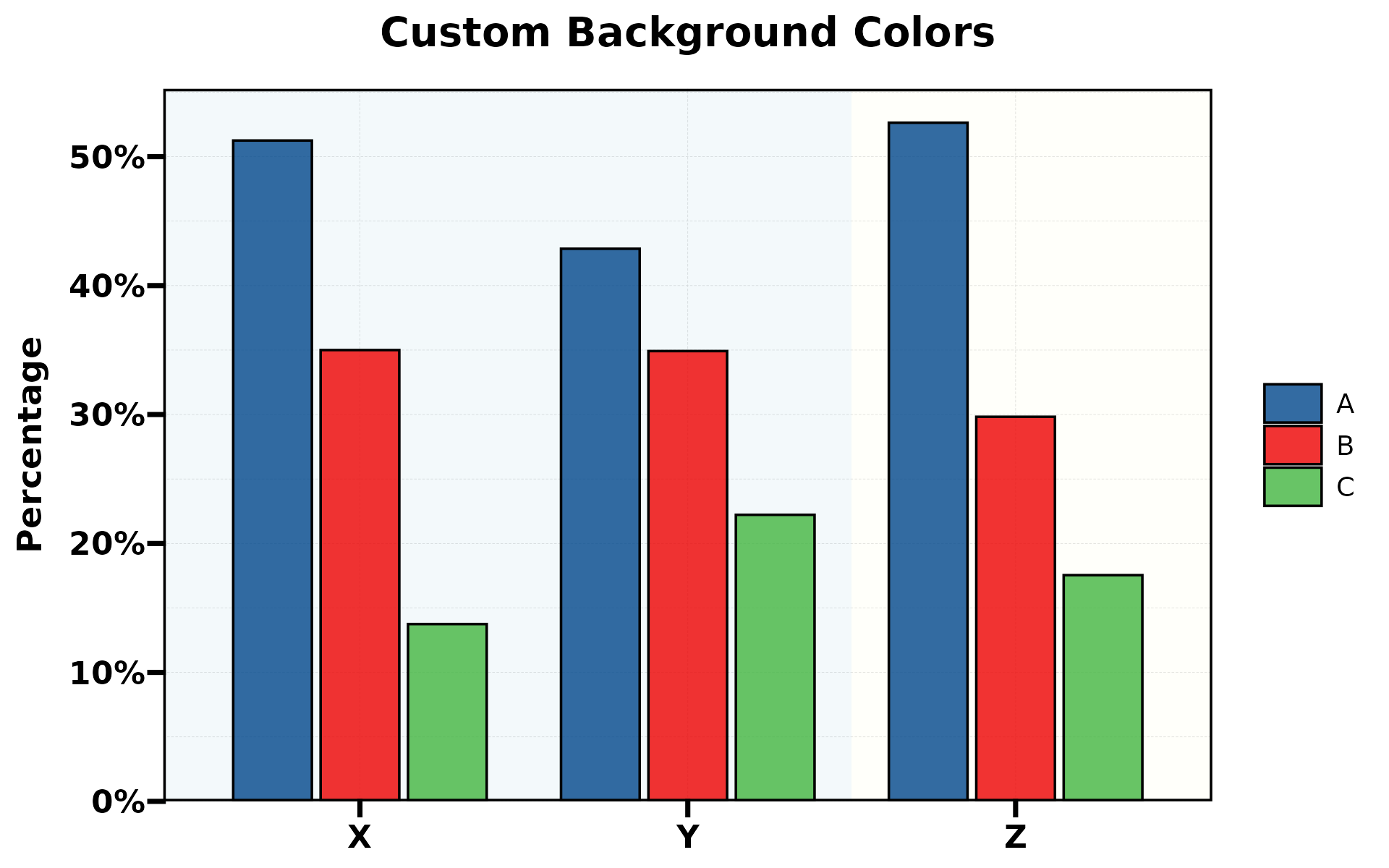
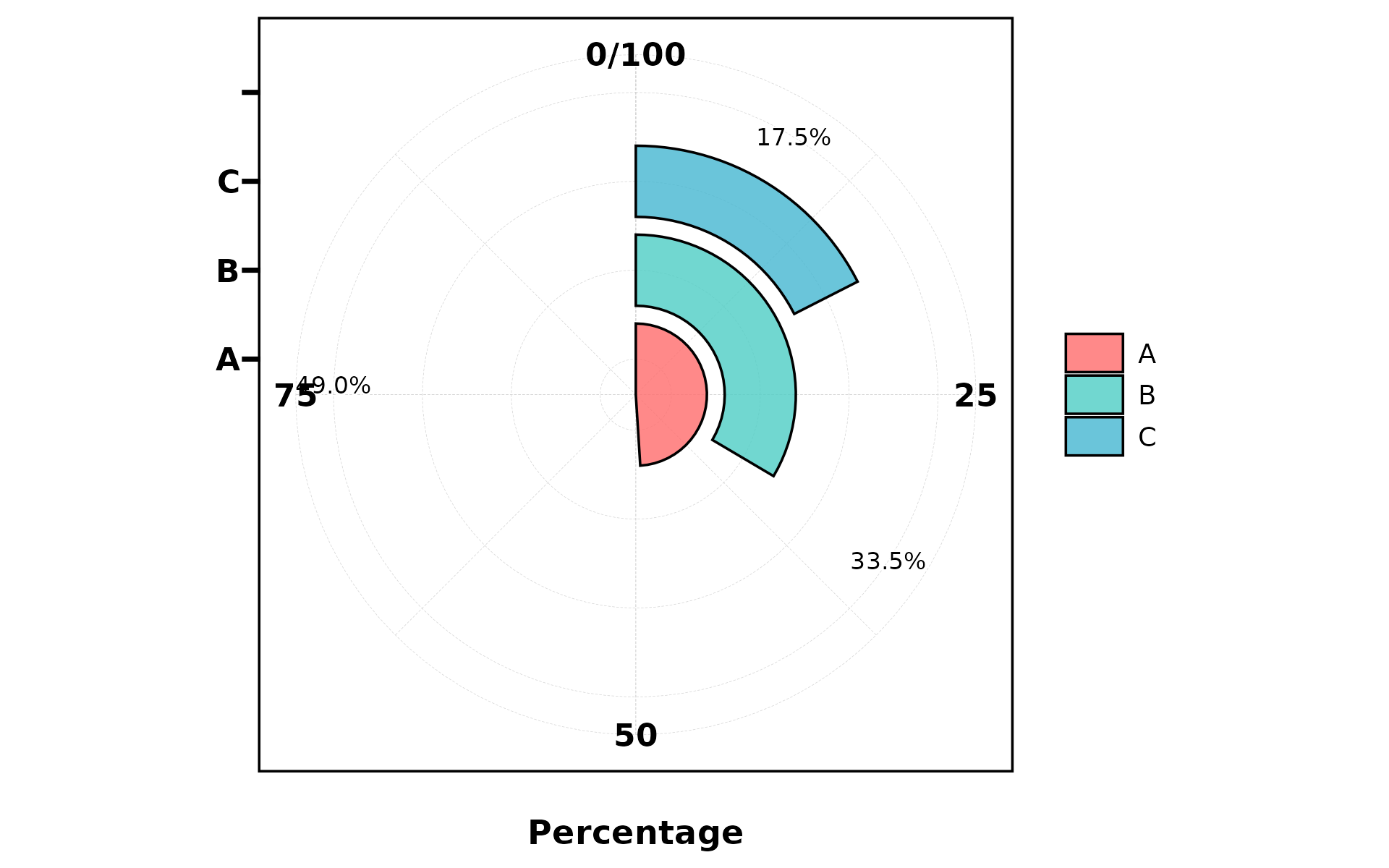
2. Rose Chart
A bar chart in polar coordinates (theta = "x"). Good for
cyclical data.
plt_cat(df, "Type", "Group", type = "rose")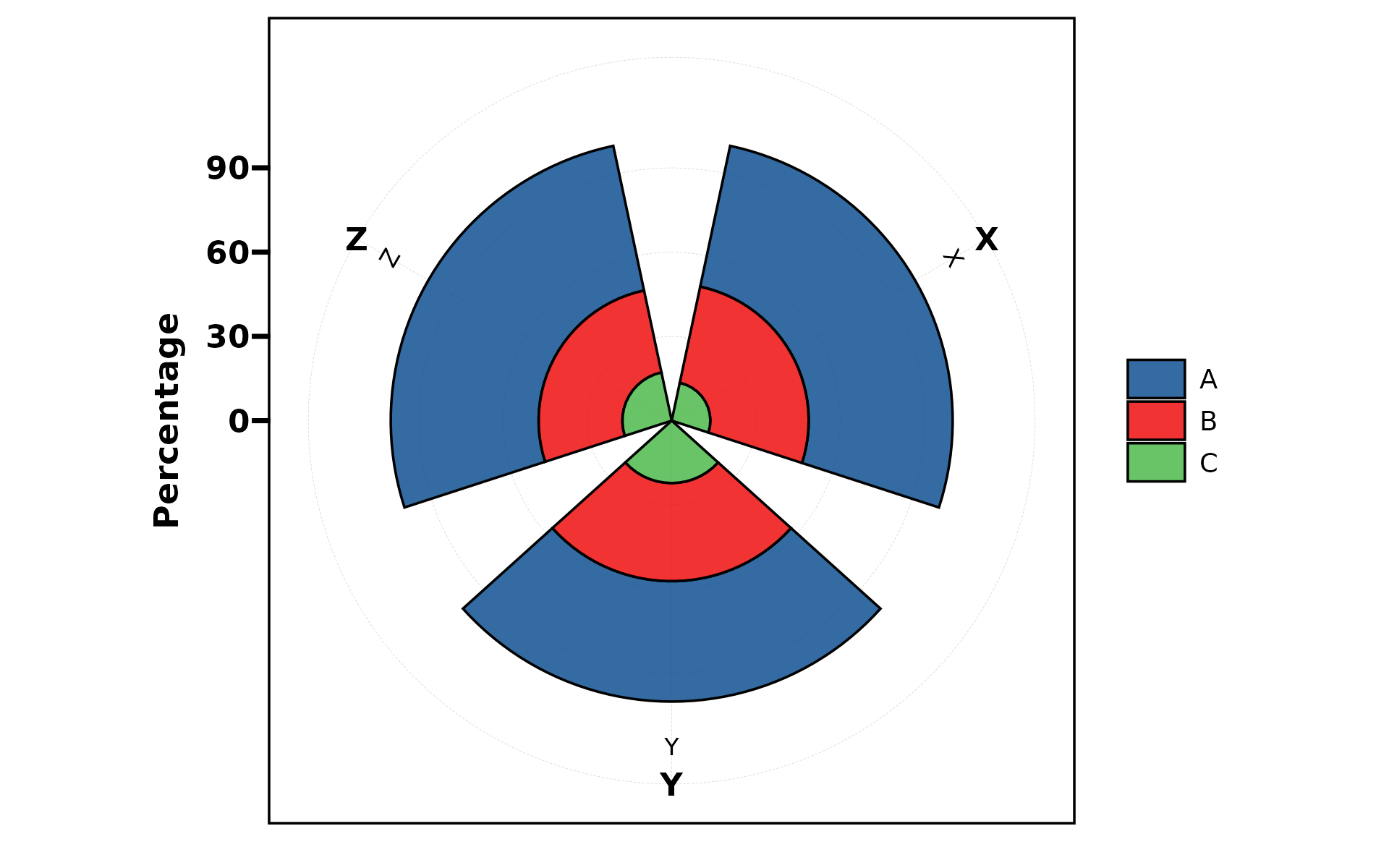
plt_cat(df, "Type", "Group", type = "rose",
        stat = "count", position = "dodge")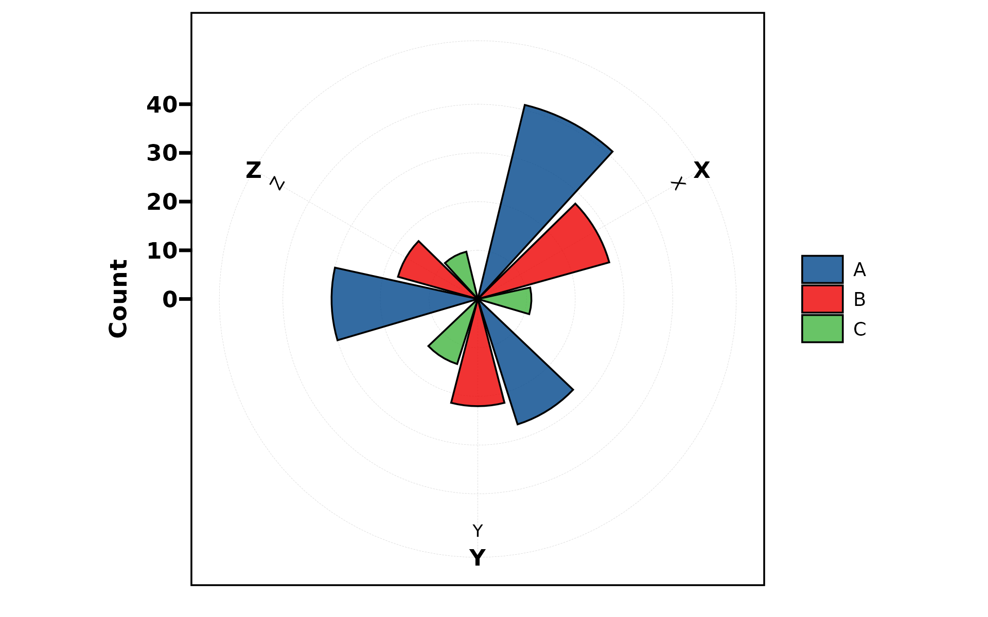
3. Ring (Donut) Chart
A pie chart with a hole in the center. Supports dodge for grouped spiral display.
plt_cat(df, "Type", type = "ring", label = TRUE)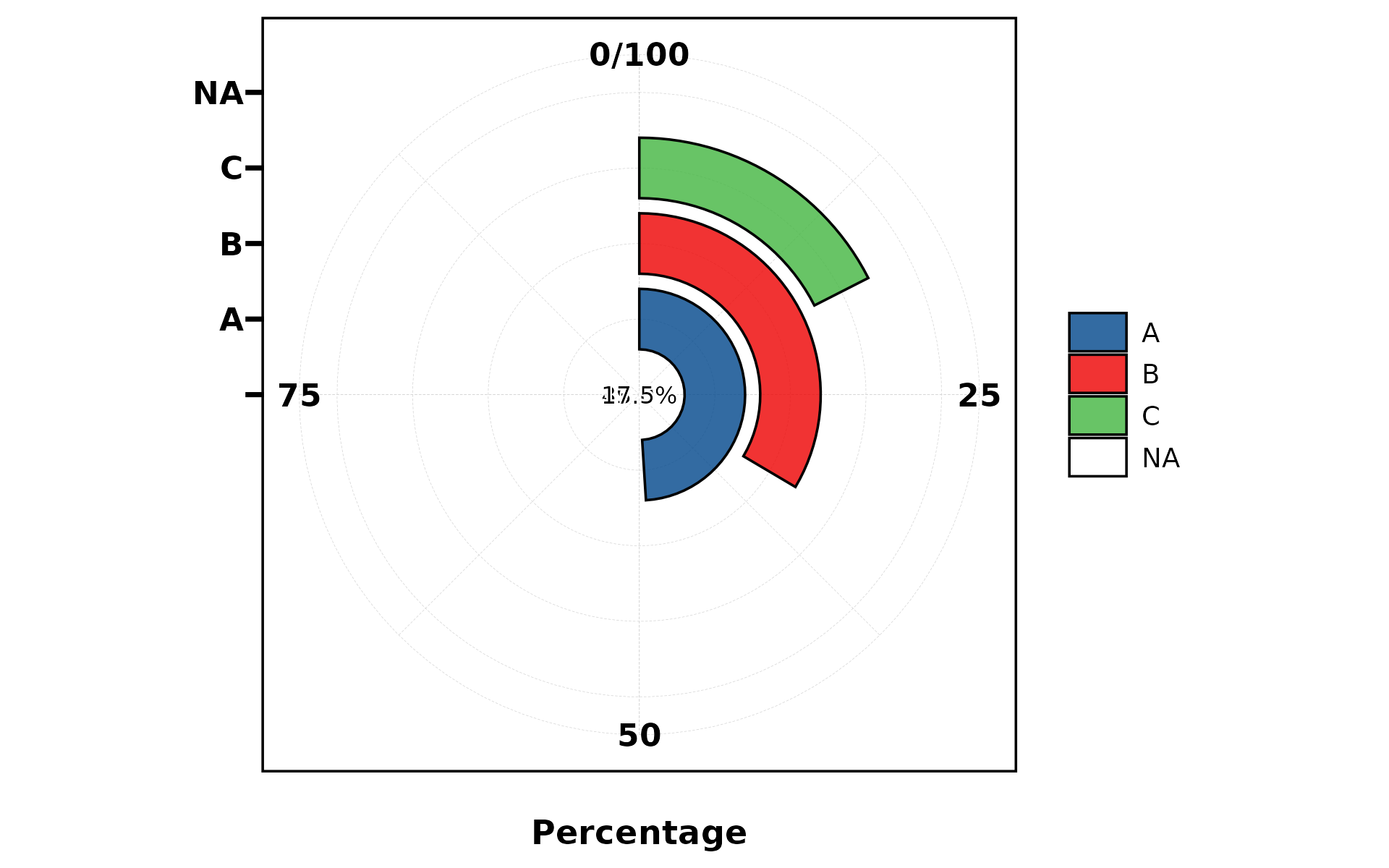
plt_cat(df, "Type", "Group", type = "ring",
        stat = "count", position = "dodge")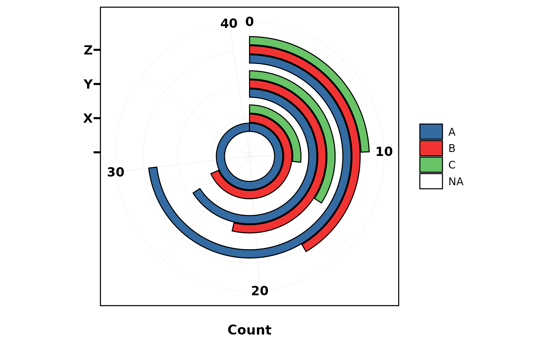
4. Pie Chart
plt_cat(df, "Type", type = "pie", label = TRUE)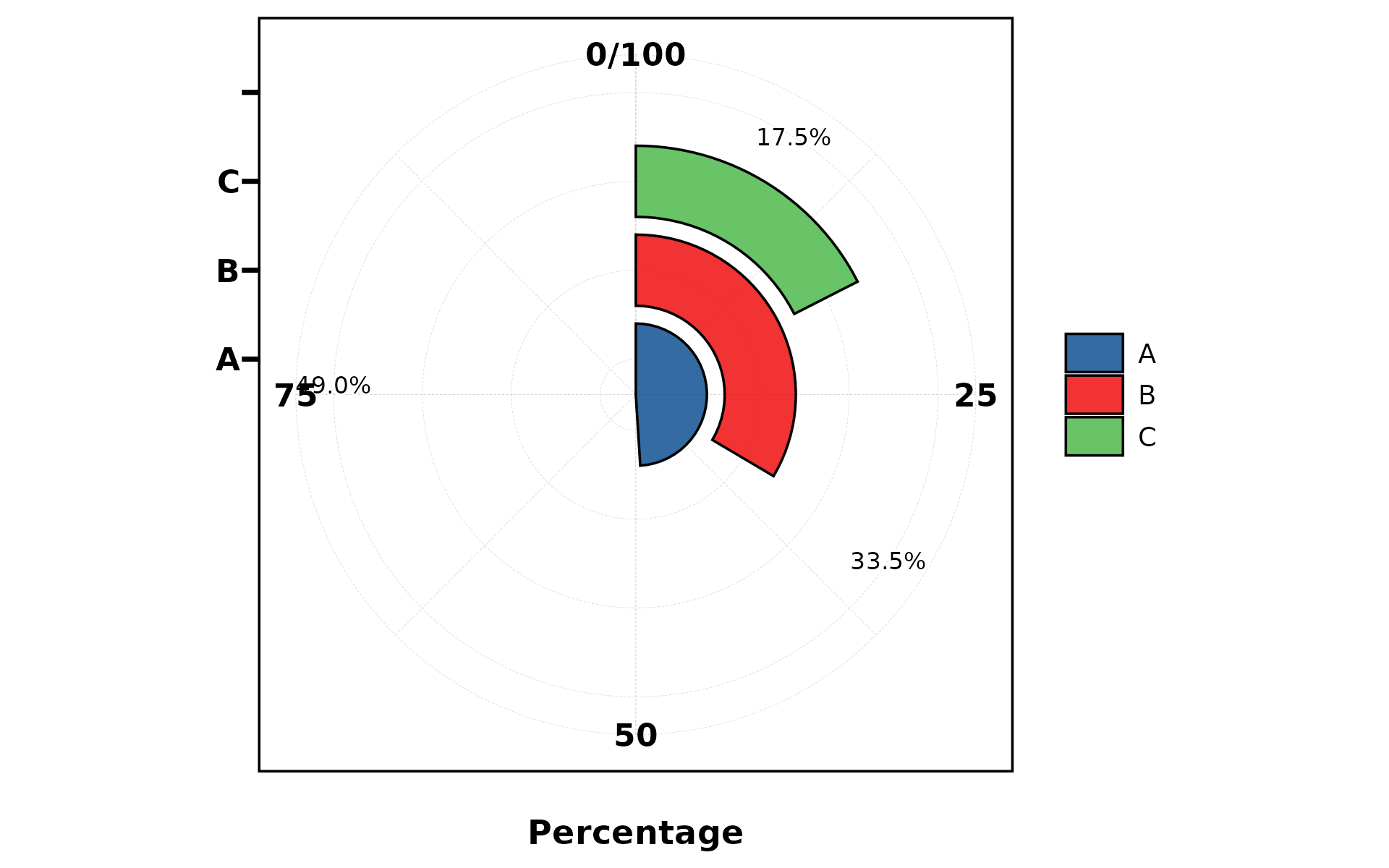
plt_cat(df, "Type", type = "pie",
        palette = "Paired",
        title = "Type Distribution",
        subtitle = "n = 200",
        legend.position = "bottom",
        legend.direction = "horizontal")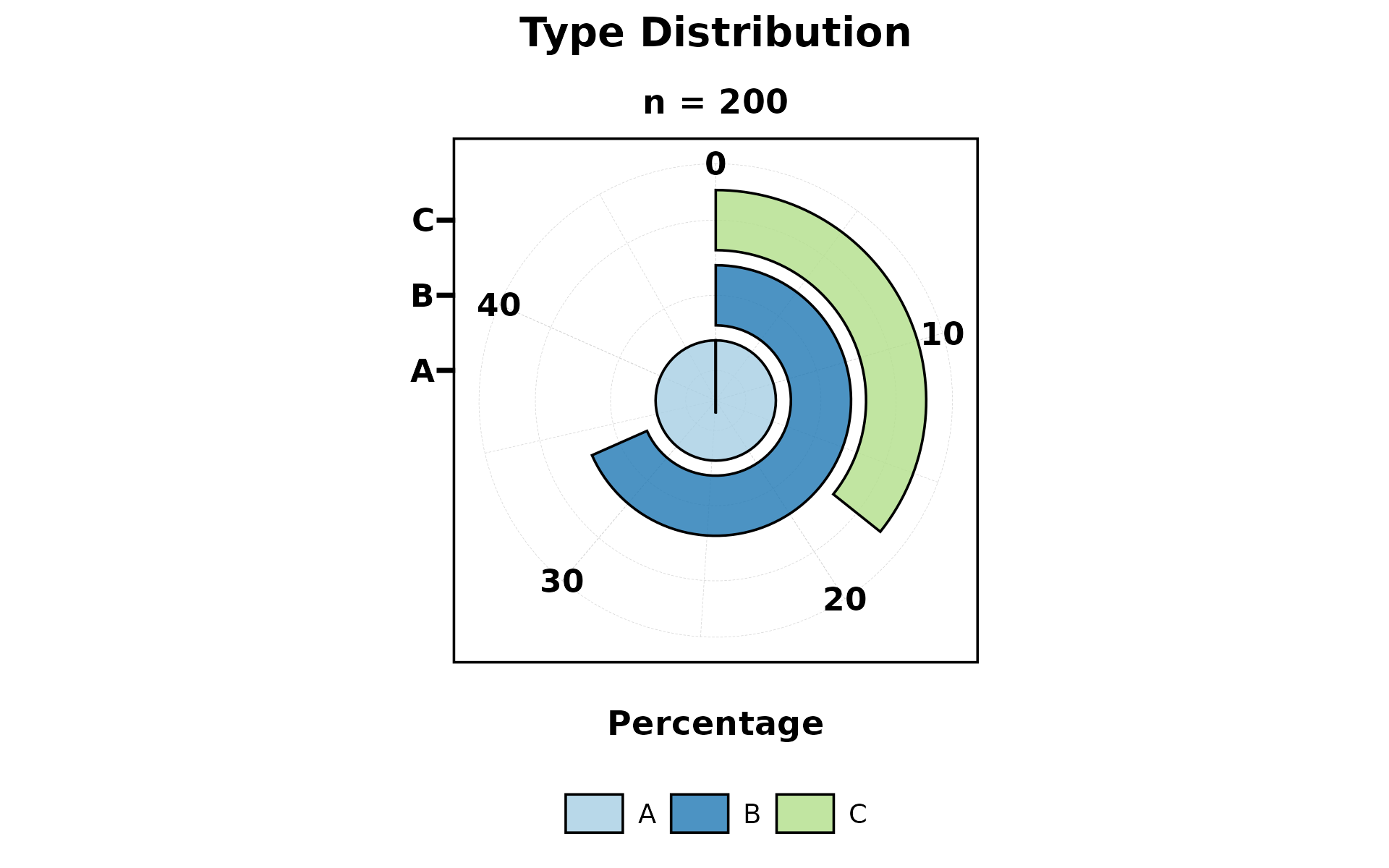
5. Trend Chart
Combines stepped area background with bar overlay. Best for showing trends across ordered groups.
plt_cat(df, "Type", "Group", type = "trend", stat = "count")
plt_cat(df, "Type", "Group", type = "trend",
        stat = "count", label = TRUE)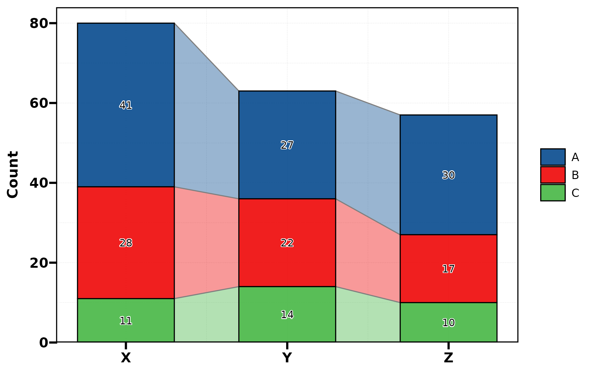
6. Area Chart
Stacked area chart. Uses continuous x-axis internally.
plt_cat(df, "Type", "Group", type = "area", stat = "count")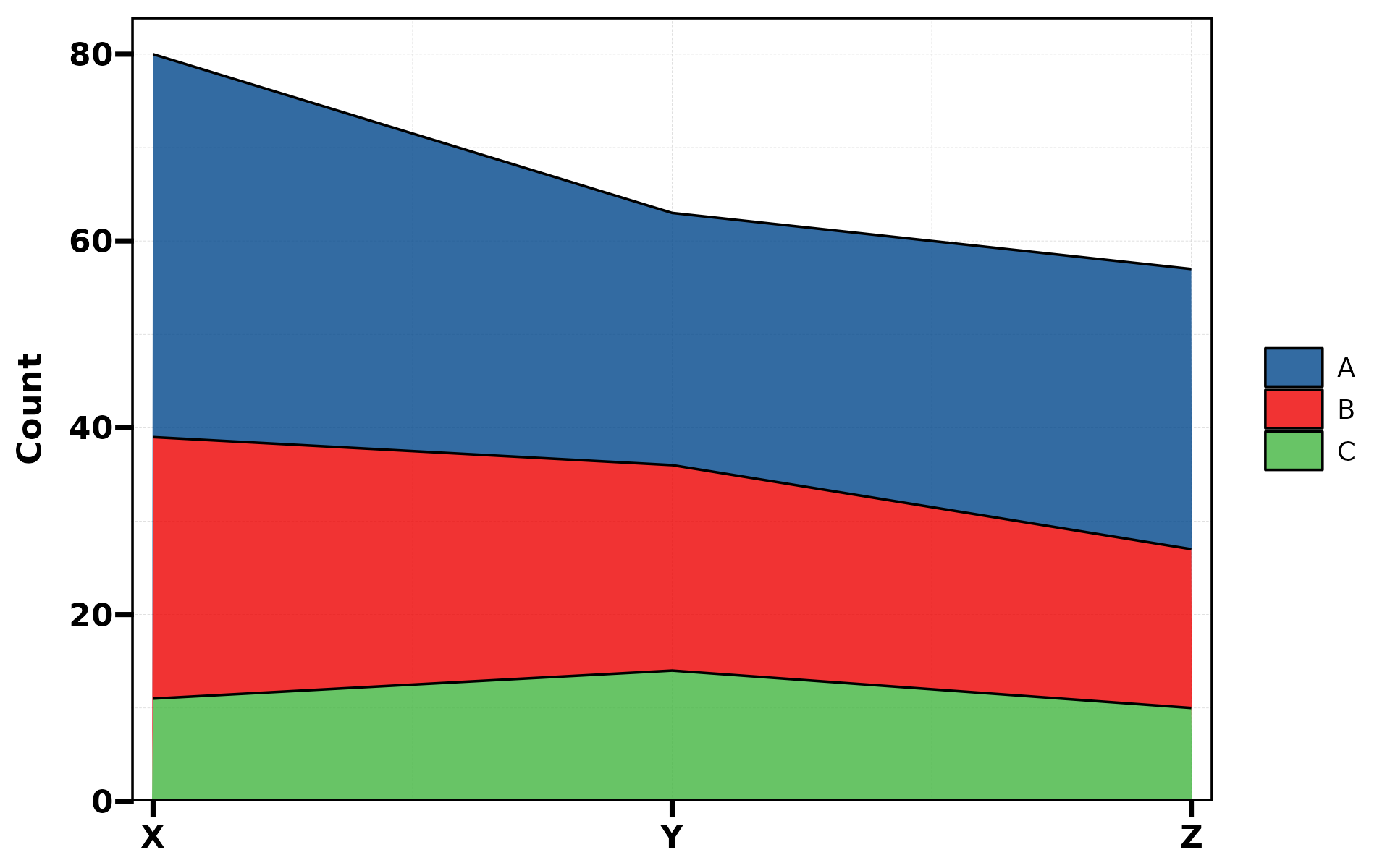
plt_cat(df, "Type", "Group", type = "area",
        stat = "count", position = "dodge")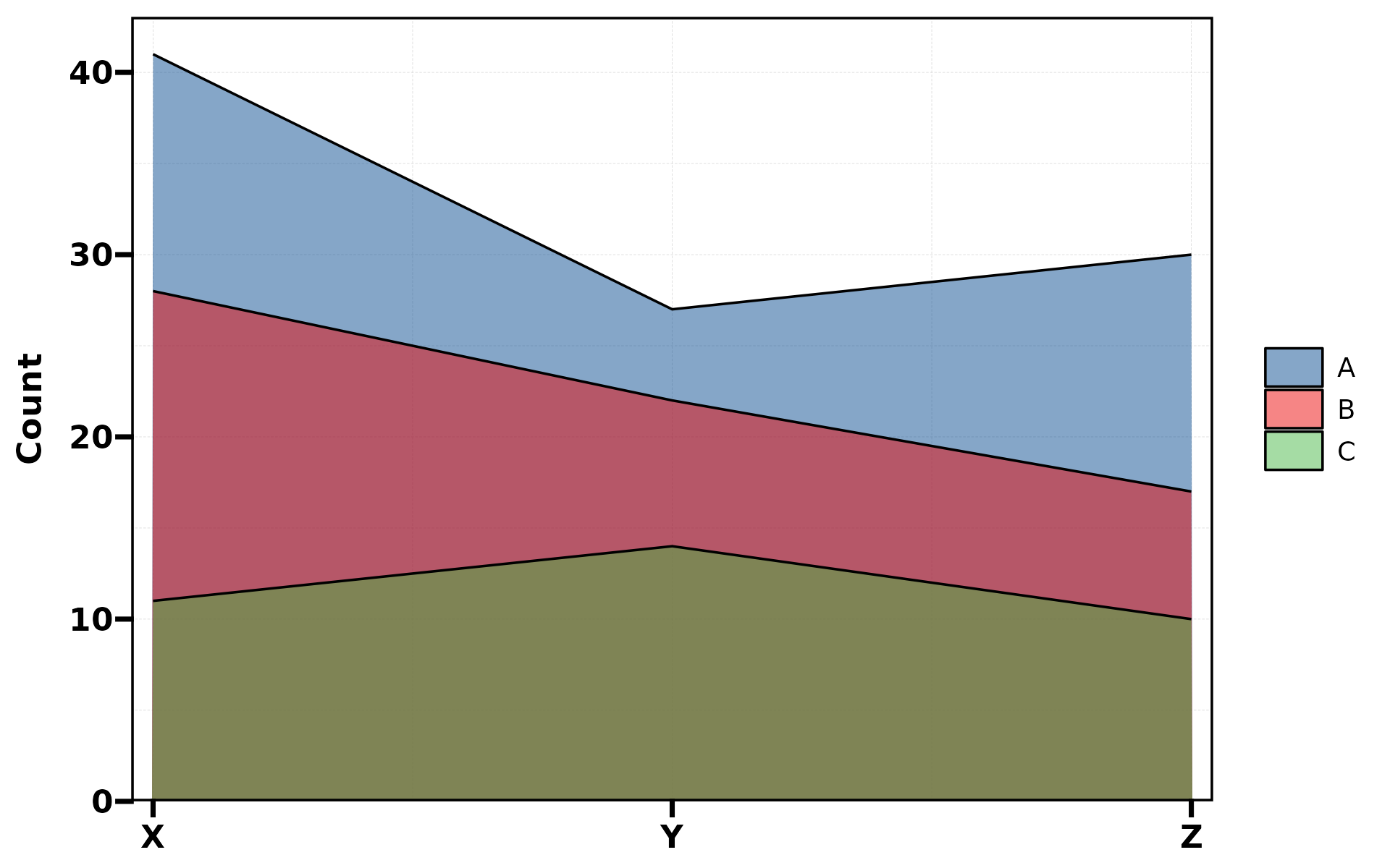
7. Dot Plot
Bubble-style dot plot where size encodes value.
plt_cat(df, "Type", "Group", type = "dot")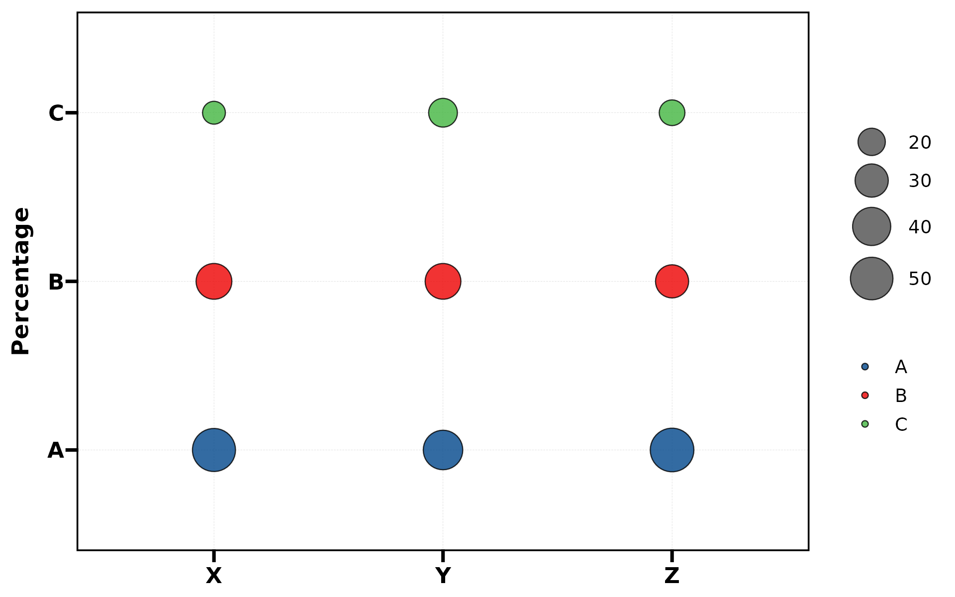
plt_cat(df, "Type", "Group", type = "dot",
        label = TRUE, stat = "count")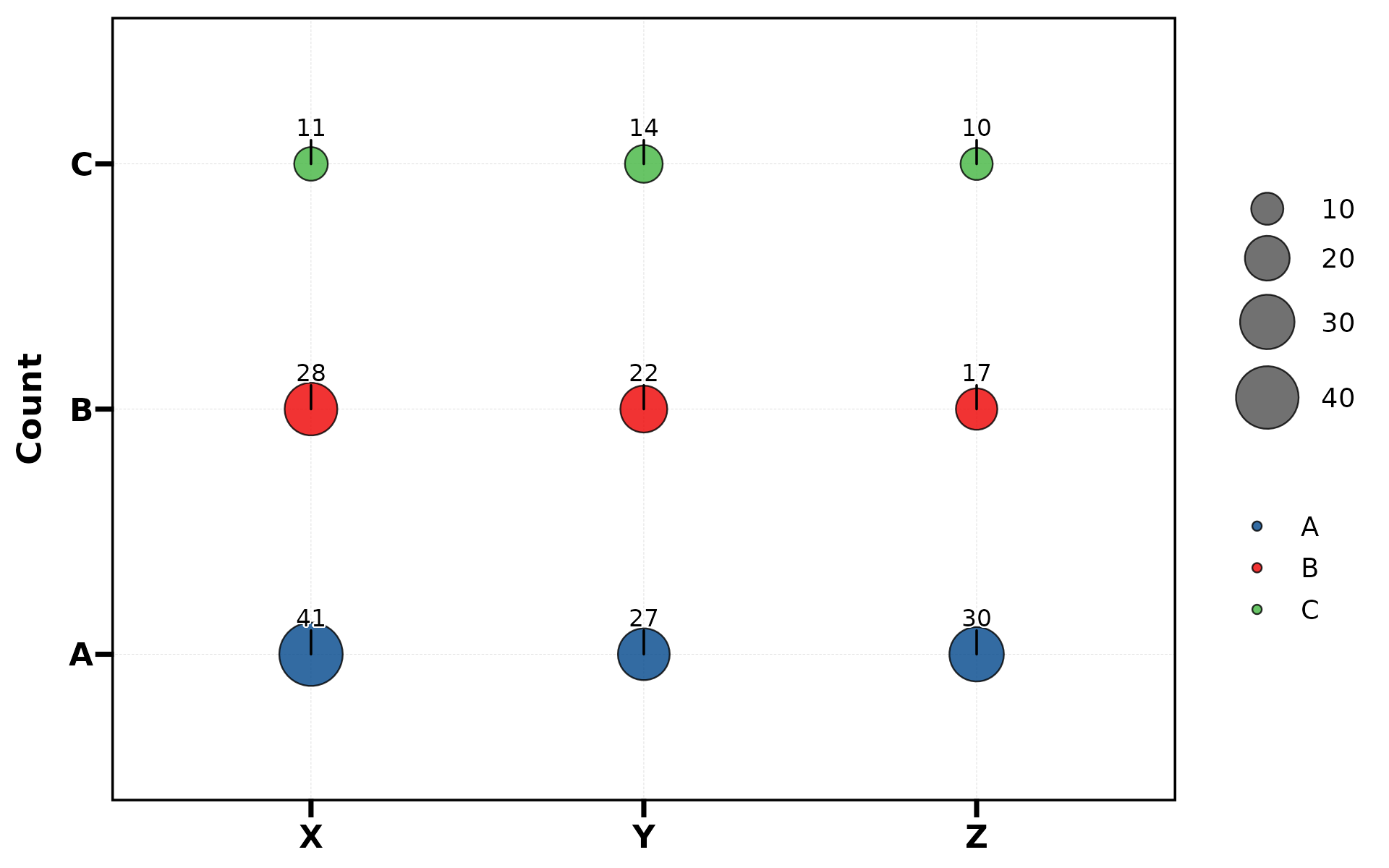
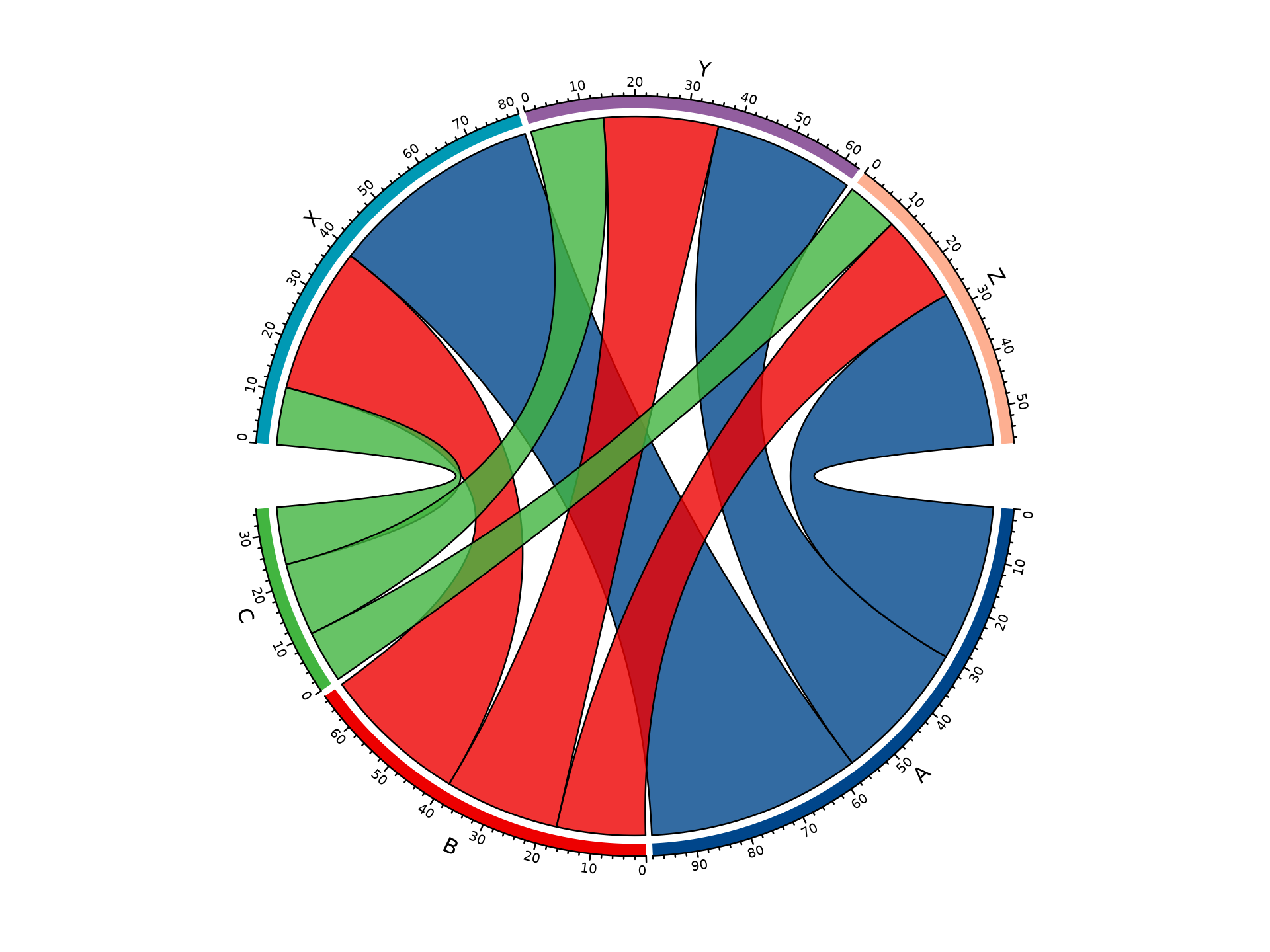
9. Chord Diagram
Shows pairwise connections between two categorical variables. Returns base R graphics (not ggplot).

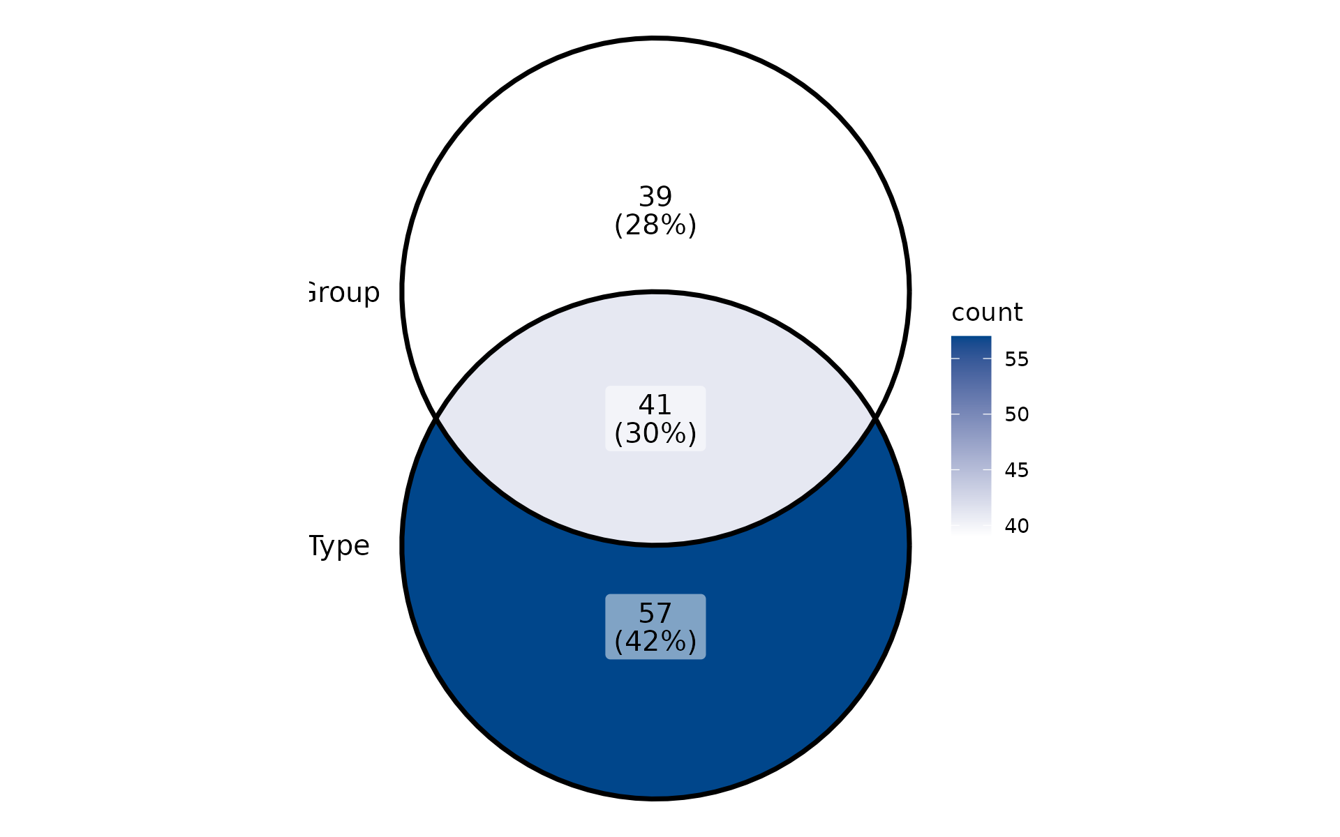
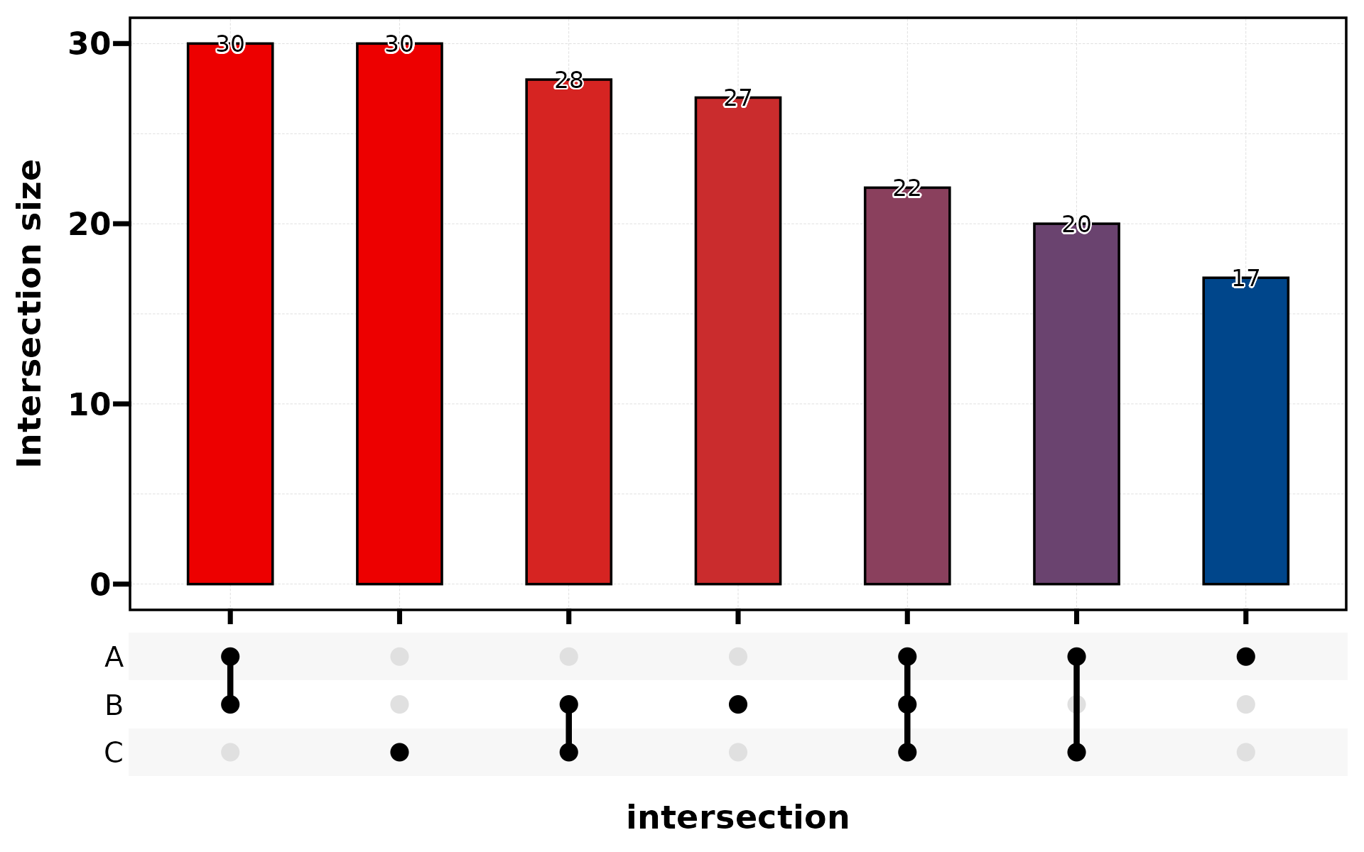
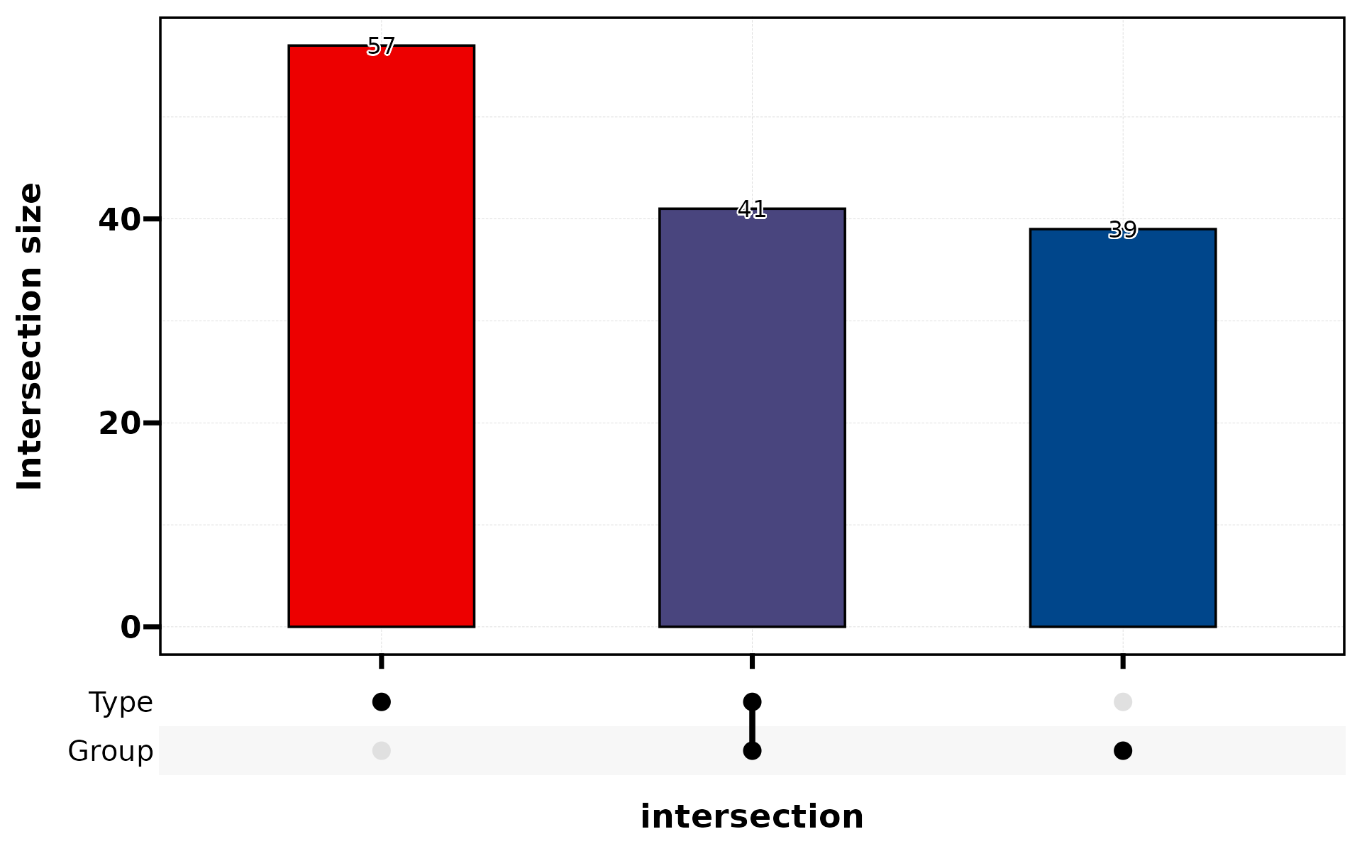
10. Venn Diagram
Shows set intersections. Use stat_level to specify which
level counts as “positive”.
set.seed(42)
df_bin <- data.frame(
  A = sample(c("Yes","No"), 200, TRUE),
  B = sample(c("Yes","No"), 200, TRUE),
  C = sample(c("Yes","No"), 200, TRUE)
)
plt_cat(df_bin, c("A","B","C"), type = "venn")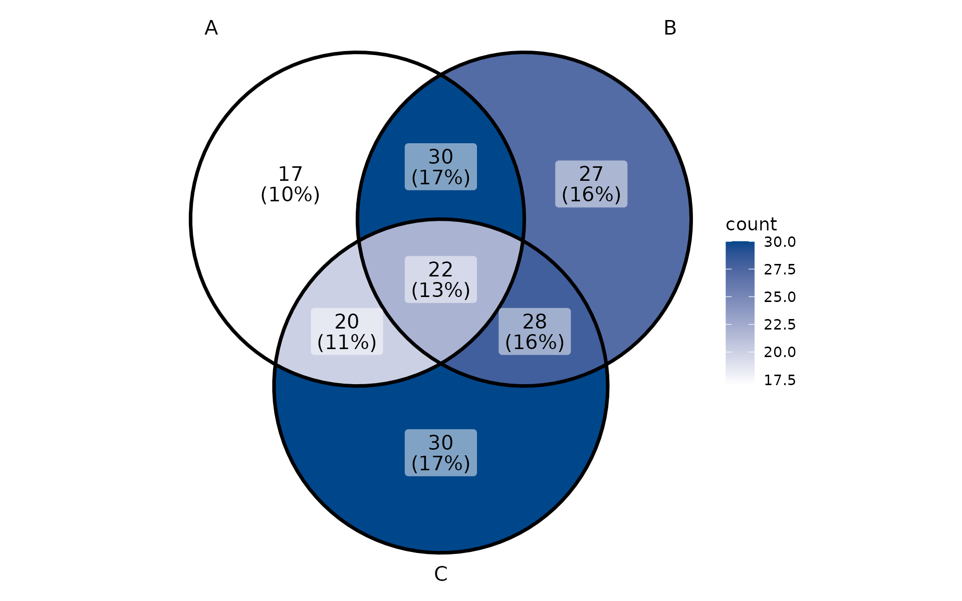
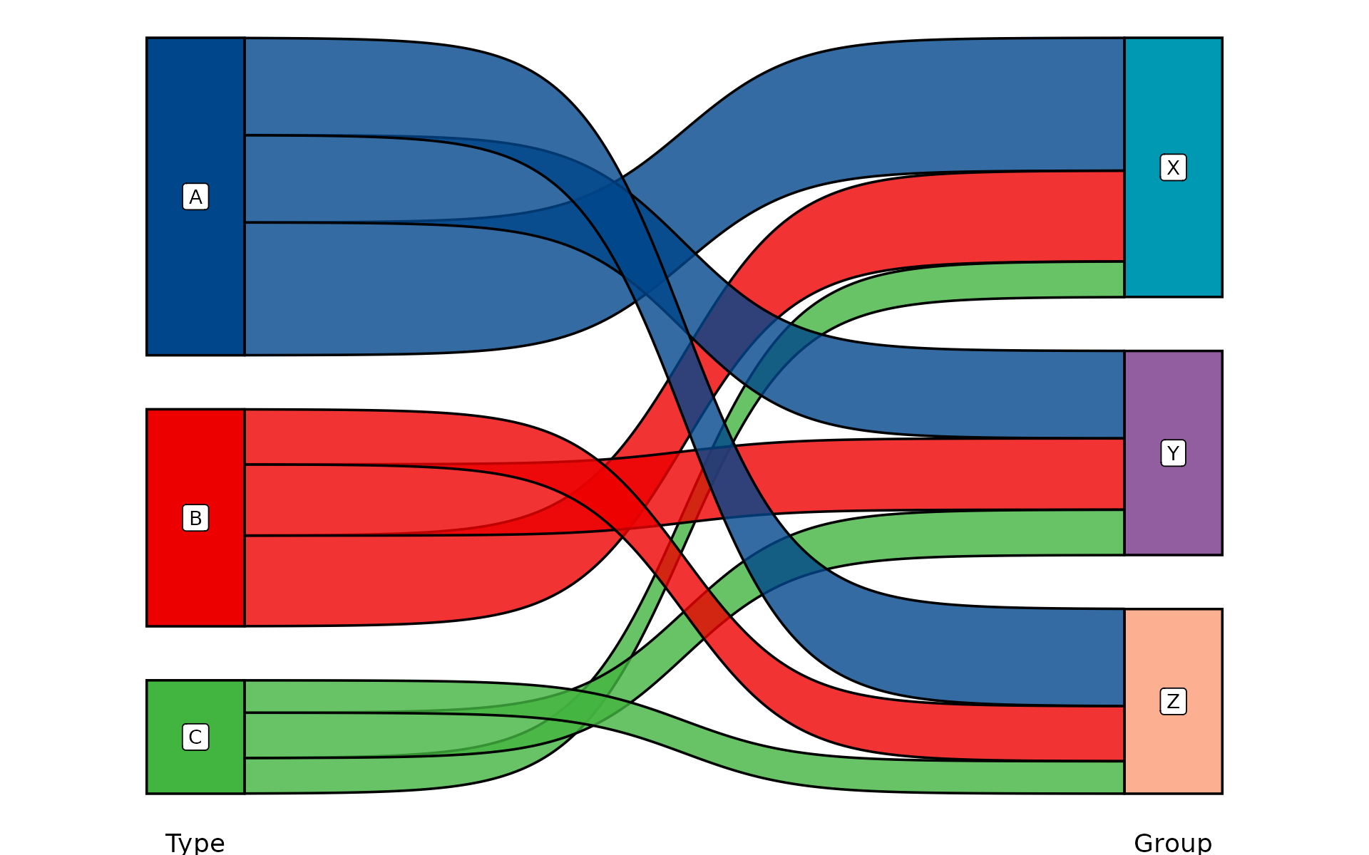
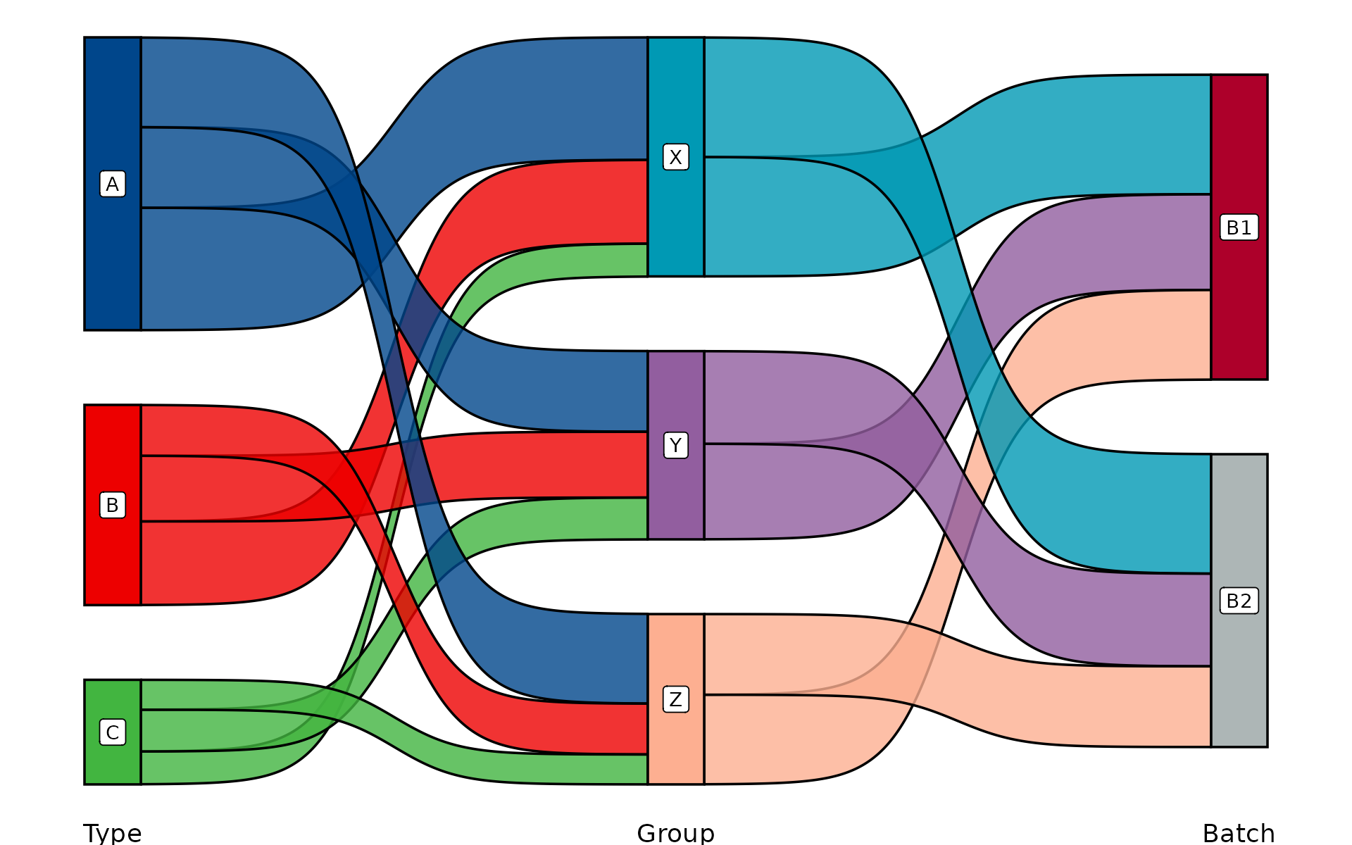
Cross-cutting Features
split.by
Split data by a variable and create one panel per level:
plt_cat(df, "Type", "Group", split.by = "Batch", type = "bar")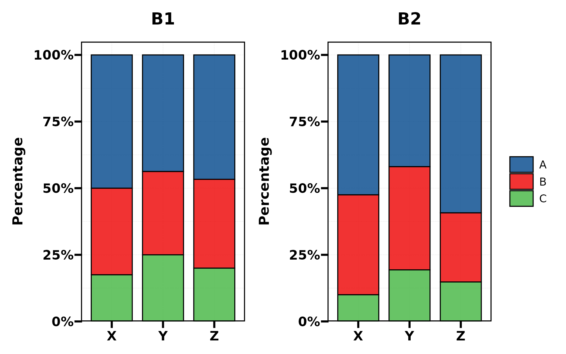
plt_cat(df, "Type", split.by = "Batch", type = "pie",
        facet_ncol = 2)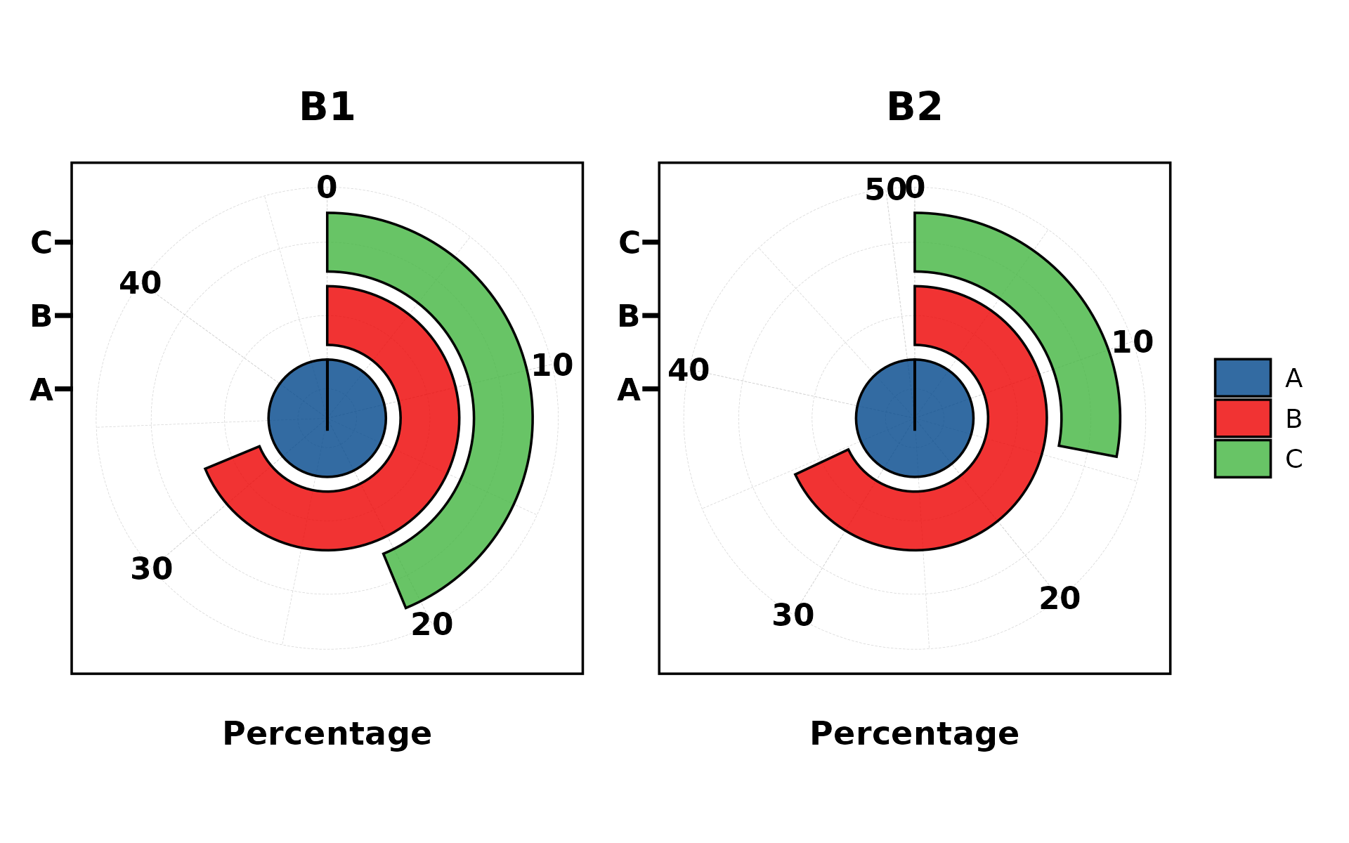
NA Handling
Include NA values in the plot with NA_stat = TRUE:
df_na <- df
df_na$Type[1:20] <- NA
plt_cat(df_na, "Type", "Group", type = "bar",
        NA_stat = TRUE, NA_color = "red")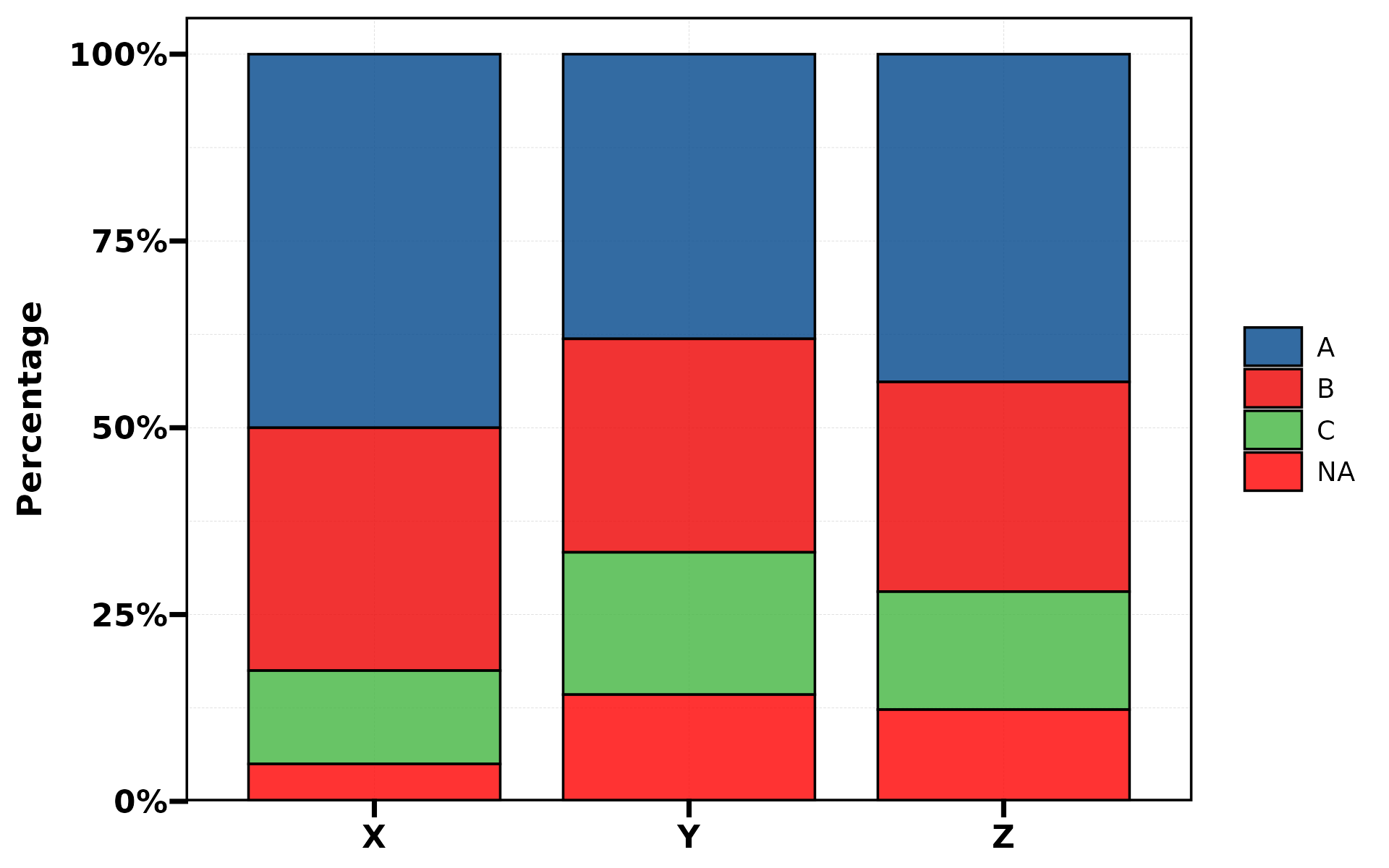
keep_empty
Preserve dropped factor levels as empty bars:
df2 <- df[df$Type != "C", , drop = FALSE]
plt_cat(df2, "Type", "Group", type = "bar", keep_empty = TRUE)![]()
Label Styling
Customise label appearance with label.fg,
label.bg, and label.bg.r:
plt_cat(df, "Type", "Group", type = "bar",
        stat = "count", position = "dodge",
        label = TRUE, label.fg = "white", label.bg = "black")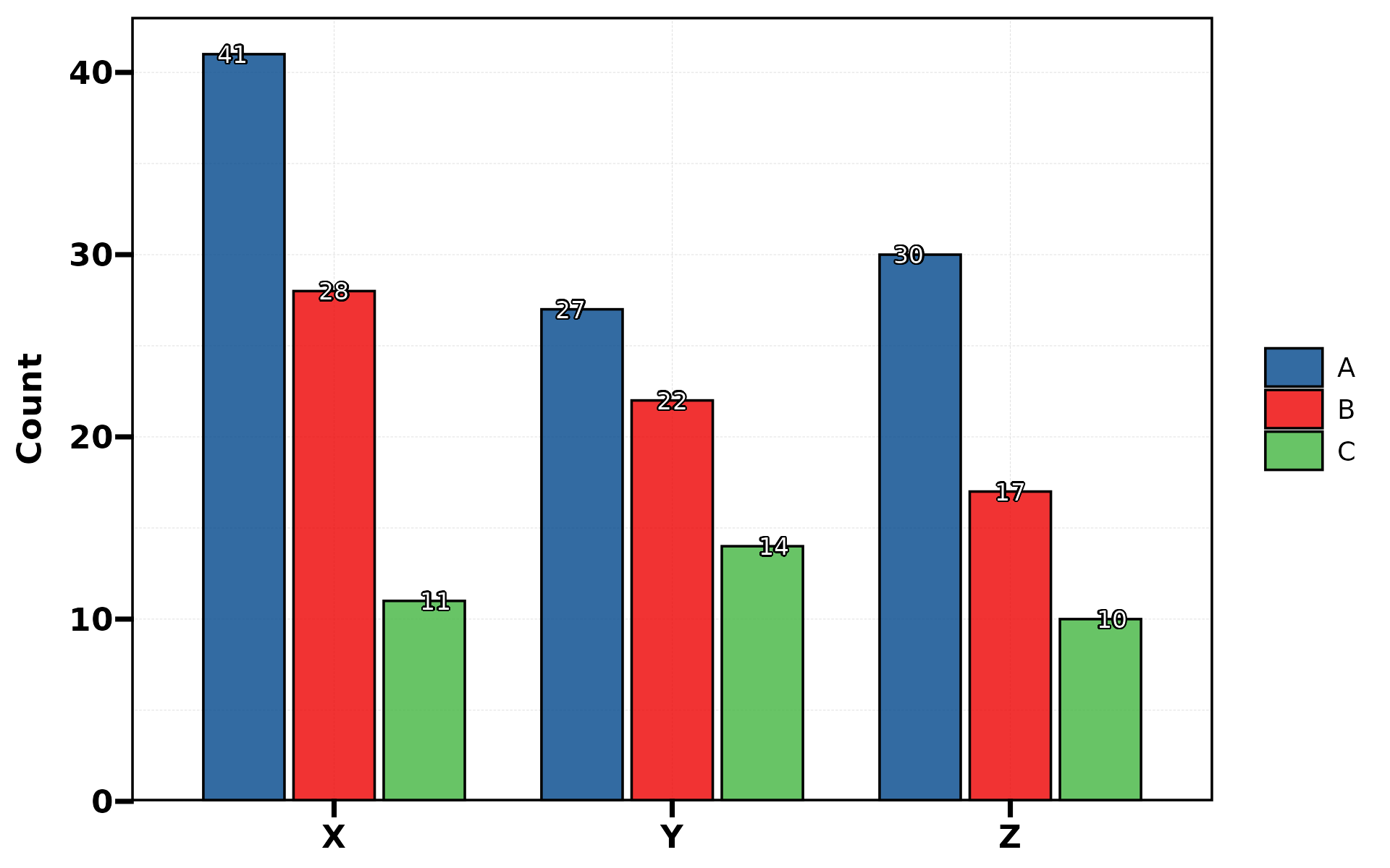
aspect.ratio
Control panel aspect ratio (auto-set to 1 for polar types):
plt_cat(df, "Type", "Group", type = "bar", aspect.ratio = 0.5)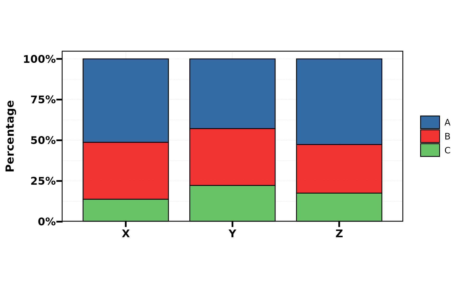
Parameter Reference
| Group | Parameters |
|---|---|
| Data |
stat.by, group.by,
split.by
|
| Chart |
type (11 types), stat,
position
|
| Colour |
palette, alpha, NA_color
|
| Labels |
label, label.size, label.fg,
label.bg, label.bg.r
|
| Background |
bg.by, bg_palette,
bg_alpha
|
| NA/Empty |
NA_stat, keep_empty
|
| Layout |
title, subtitle, xlab,
ylab
|
| Legend |
legend.position, legend.direction
|
| Aspect | aspect.ratio |
| Split |
facet_nrow, facet_ncol,
facet_byrow
|
| Set types | stat_level |
| Safety | force |